Cart
0
You may also like
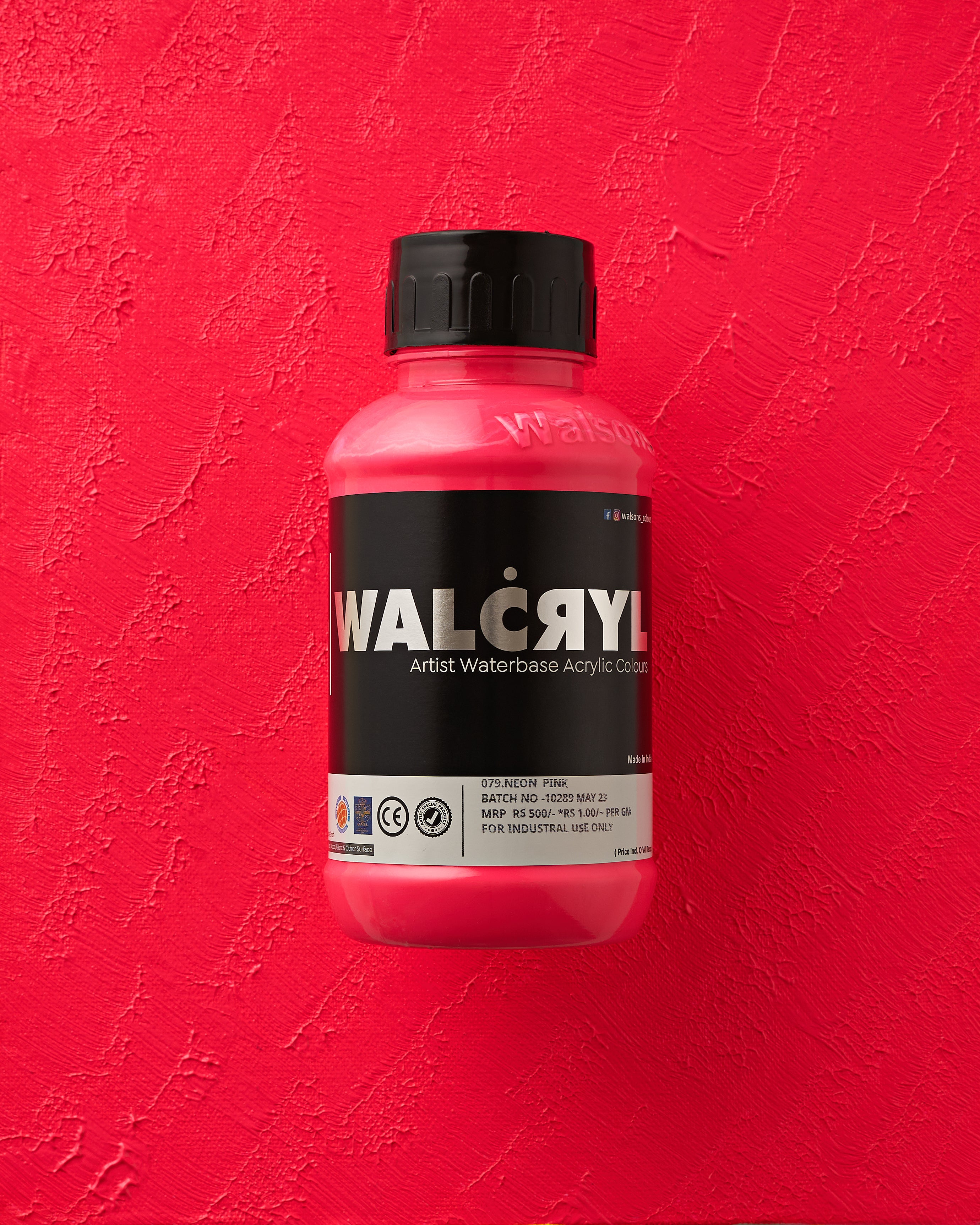
079 Neon Pink - WALCRYL Artist Waterbase Acrylic Colours
Regular price
Rs. 460.00
Rs. 500.00
Sale price
+ Add to Cart
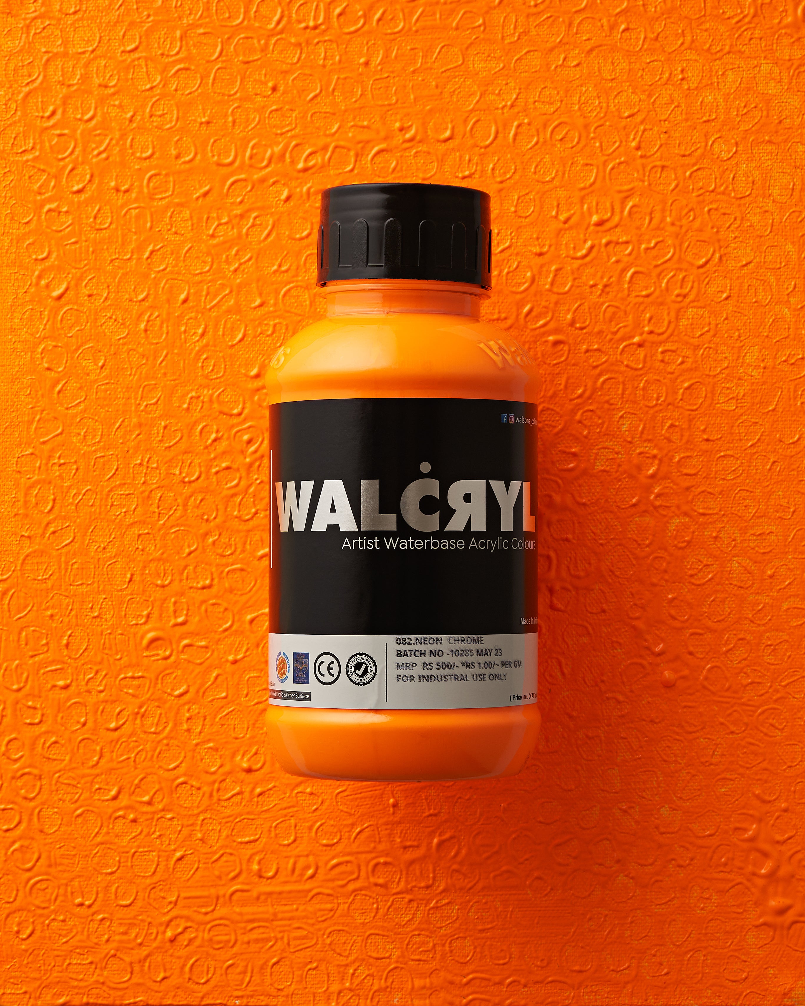
082 Neon Crome 082 - WALCRYL Artist Waterbase Acrylic Colours
Regular price
Rs. 460.00
Rs. 500.00
Sale price
+ Add to Cart
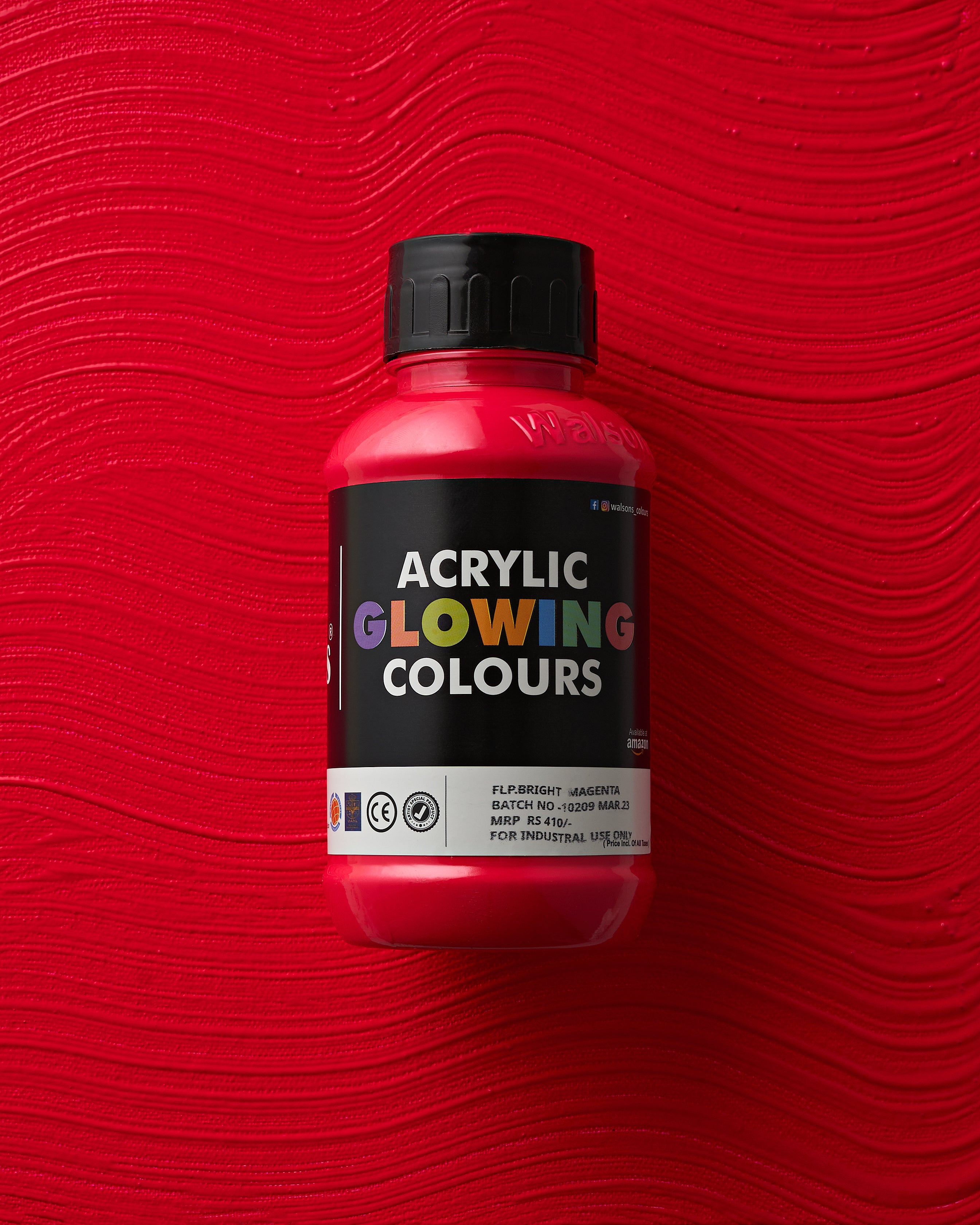
FLP. Bright Magenta - Acrylic Glowing Colours
Regular price
Rs. 380.00
Rs. 410.00
Sale price
+ Add to Cart